Website Design Projects
Creating for you. It’s what we do.
Being a part of your growth is what drives us. We are excited to share in your success. Following are a few website design projects we’ve proudly crafted for others.
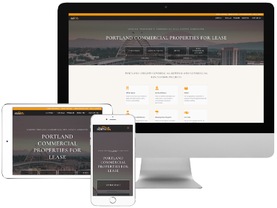
Commercial Real Estate Website Redesign
Modernize and improve user experience.
Our commercial real estate client came to us to ask for a redesign to their website to help set them apart in the competitive Portland market.
They wanted the new website to be more modern, cleaner and easier to use for prospective tenants and investors. They also wanted their current tenants to have easier access to maintenance request and registration forms. Using Divi, Formidable Forms and ACF, we developed a website that delivers on all!
Senior Caregiver Website Redesign
More modern with improved, more engaging, copy.
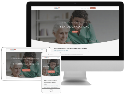
The owner of this senior caregiving referral service client came to us with a website that was saying mixed messages and confusing the visitor.
We redesigned the website to both modernize the look and feel, but also to better communicate her services with new copy that better communicates her services.

Senior Caregiver Website Redesign
More modern with improved. more engaging, copy.
The owner of this senior caregiving referral service client came to us with a website that was saying mixed messages and confusing the visitor.
We redesigned the website to both modernize the look and feel, but also to better communicate her services with new copy that better communicates her services.
Food Content Creator Website Refresh
Faster & easier to use!
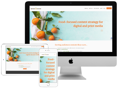
When we met with the website owner, she was frustrated with the old builder interface and wanted a faster, easier to use website to showcase her delicious food-focused content.
We re-built the website using Divi and the existing content and layout, adding and deleting a bit to improve flow. We improved accessibility and SEO and added updated legal policies. The new website is faster, easier to use, and meets the current demands of website visitors and search engines.
Tax Preparer Website Design
A facelift and a client portal.
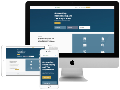
When we took on this client’s website redesign, it was a sight! It was hosted on the platform Yodle and the phone number they forced her to place on the website did not accurately route calls to her so she was missing calls and losing leads.
We redesigned the website to include all of her services, clearly outlined for potential clients, clearly provide her contact information and include a link to her client portal which was one of the things on her wish-list.
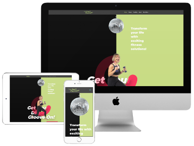
Online Fitness Coach Website Redesign
A bold and colorful redesign!
This website is for an online fitness coach who is truly an inspiration. She wanted a new website with better navigation and one that was a better reflection of her personality.
She is also a graphic designer and came to us with a bright color palette, bold imagery and a personality to match. So there was only one choice – we went big and bold too!
Therapist Website Redesign
A redesign was a more affordable solution.
Emily was first hoping we could assist her with fixing her existing website, but after some consideration, it became clear that it was more cost-effective to build her a new one! And that’s sometimes what happens when you delve deeper into what’s needed to bring a website up to today’s standards.
The newly re-designed website is a better reflection of her, her practice and her goals as a therapist.
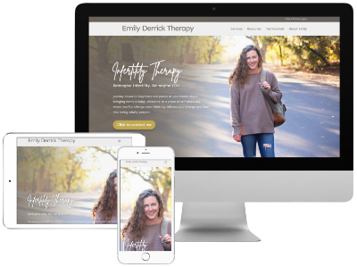

Therapist Website Redesign
A redesign was a more affordable solution.
Emily was first hoping we could assist her with fixing her existing website, but after some consideration, it became clear that it was more cost-effective to build her a new one! And that’s sometimes what happens when you delve deeper into what’s needed to bring a website up to today’s standards.
.
The newly re-designed website is a better reflection of her, her practice and her goals as a therapist.
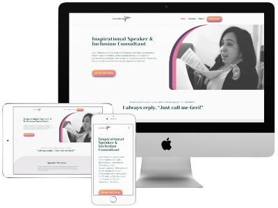
Inspirational Speaker Website Design
A redesign long overdue.
This website was long overdue for a redesign. The owner has amazing story, but had been burned by a previous developer. Our goal was to not just build her a great website, but to also build trust that we could deliver a website that reflected her and her story.
She is a true inspiration! We are honored to have been able to deliver a website that shares not only her story, but also gives her prospective clients a clear means to learn about her services and connect with her.
Blog Website Design
A book review blog & shop.
A new Young Adult bookstagramer wanted a website that was reflective of her tastes and aesthetic. She asked that we integrate her color scheme ideas – cream, greys, dark brown and green accents.
The resulting WordPress website includes her monthly young adult book reviews and social links. The goal was to add an e-commerce shop with curated items that compliment the bookish lifestyle. On the one year anniversary of the website, a Woocommerce store was added.
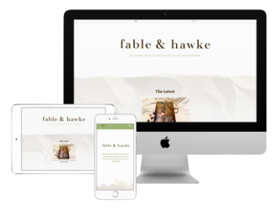

Blog Website Design
A book review blog & shop.
A new Young Adult bookstagramer wanted a website that was reflective of her tastes and aesthetic. She asked that we integrate her color scheme ideas – cream, greys, dark brown and green accents.
The resulting WordPress website includes her monthly young adult book reviews and social links. The goal was to add an e-commerce shop with curated items that compliment the bookish lifestyle. On the one year anniversary of the website, a Woocommerce store was added. Check out Fable & Hawke!
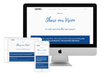
Online Auction & Fundraising Platform
Solved a unique need and saved precious funds.
A booster club at a local high school was not able to find a platform to met their specific needs. Simple in design, we developed a website that handled online dinner ordering, the silent and live auctions, online donations and email communications.
We saved them the cost of using an auction platform, increasing their net. The event raised nearly $30,000 before expenses. We went on to re-purpose the website for them the following semester as a peer-to-peer fundraising platform.
Logo and Website Design
Refresh and modernized to be more competitive.
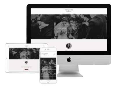
Occasions by Design was a re-branding project including logo and website design for an event planner. The goal was to re-position the event planner to help increase awareness in a very competitive market, modernize the website and provide a new logo. The branding was changed to emphasize the design aspect of the events.
For the website, we went with oversized imagery, updated the color palette and brought in a more upscale look and feel. This website looks great on both desktop and mobile! In modernizing the branding and website, a cleaner and modern logo went along with the project.
Website and Graphic Design
A full branding and marketing suite.
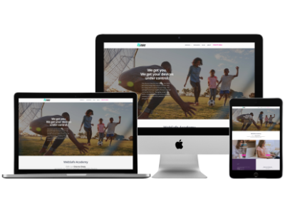
This was a full website and graphic design project for a service helping families trying to keep to their kids safe online. This project included branding, logo, font selection, website, tagline, social & Google ads, flyers, banners, and other collateral.
A number of tools and integrations were utilized for this website including marketing email, CRM, calendar of events, bookings, social media feeds, videos, forms and client surveys.
Church Website Redesign
A modern new look to attract new members.
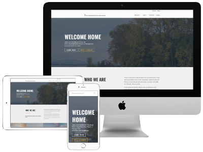
We had re-designed the website a few years ago, but the church’s new pastor decided it was time for a new homepage. In addition to the new, more modern homepage look, we also updated all the relevant information, updated the fonts to match the homepage and spiffed up a few other pages.
The website now has a more modern look to attract a younger audience, publish their monthly newsletter and accept online donations.
Microsite Design
Built to promote healthy eating.
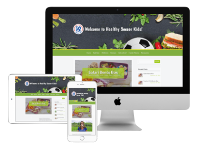
Healthy Soccer Kids is a microsite development project for AYSO. The site was created from Photoshop mockups provided by their marketing department. The microsite supports their sponsor Nesquik and the promotion of healthy eating for soccer families. The microsite includes recipes, tips for healthy eating for active families. It also has an ad module for other AYSO sponsors. We enjoyed working on this collaborative effort with the folks at AYSO.
Real Estate Listing Website Design
Attract potential buyers to the open house.
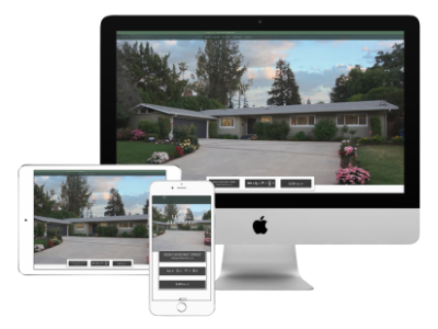
This single page brochure website design sample was for a real estate listing. The goal was to provide the listing information and photos with a modern, upscale look that reflected the status of the property listing – with the ultimate goal of attracting potential buyers to the open house. This design & development suite included the website and an accompanying open house flyer.
The website was utilize to promote the listing on the MLS and on social media.
Preschool Website Design
A website fit for an award winning preschool.
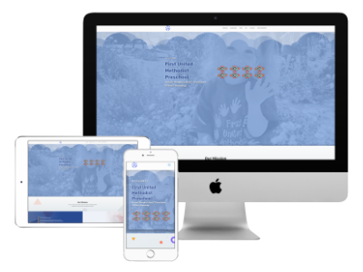
Having first redesigned the website for the church, the pastor of the church decided it was time to invest in the website for the Preschool which was severely out-of-date. This is another great example of how an affordable, single page website can work really well to communicate the necessary information.
Plumbing Contractor Website Design
An effective single page layout.
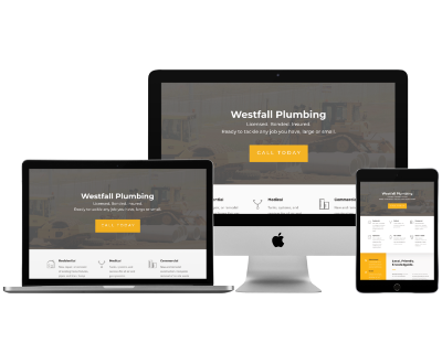
This is a great example of a single page website that may sufficient for many businesses. This single page website is an affordable, simple example that communicates the most important information to a potential client/customer. Many businesses, especially those in the service sector, can have an effective website with a single page layout.
A few that come to mind are therapist, electrician, plumber, tutor, educational therapist, cleaning company, and preschool – just to name a few.
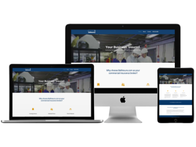
Insurance Broker Website Design
Set this broker apart from their competition.
In the highly competitive commercial insurance business, this insurance brokerage needed to set their concierge service apart from the competition. The client asked for a website that would better communicate their services to potential clients.
We did this by using oversized imagery of potential clients, outlining their differentiation. We established trust through a branding palette of dark blue and white with gold accents. The project also included a new logo.
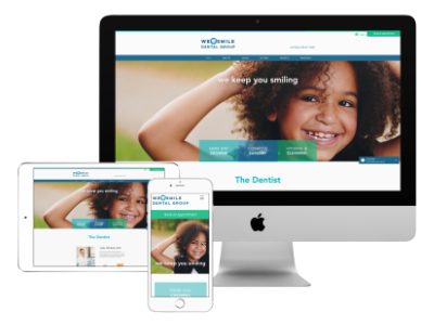
New Logo and Website Redesign
Modernize the logo and website.
This was a fun new logo and website redesign for a dental practice. The goal with this project was to modernize the website and logo to help make the practice more competitive and provide better customer experience.
The use of oversized imagery of smiling faces and fresh, clean colors, gave the website a more upscale look and feel. A new logo was developed with a more modern look and an approachable “smile” effect.